How To Use 2021 Colours Of The Year In Your Kitchen & Bathroom
As 2021 gets off to an uncertain start, Dulux and Pantone have released their 2021 Colours of the Year to help inspire homeowners decorate and transform their homes. There are many ways that these colours can be used stylishly in any style of home and any type of room. If you are considering decorating in the new year, some of the most useful things to do is check out the latest trends for 2021.
What are the colours of the year for 2021?
This year Pantone have declared two appropriate colours as representative of 2021 rather than just one: ‘Illuminating’, a soft yellow tone representing vibrance, hope, and optimism, and; ‘Ultimate Grey’, a solid and dependable grey tone that represents strength and resilience. Similarly, Dulux have declared their colour for 2021 to be ‘Brave Ground’, a warm, earthy shade that draws from the raw strength of nature and exudes growth and stability. For homeowners looking for some new colour inspiration in the new year, there are many ways to style a home with these three gorgeous colours.
Seasonal Trends
Both architecture and design play an important part in designing a home that you will love for years to come. A major factor in home design is of course the colour scheme. Decorating in the new year by using palettes from Pantone and Dulux is a great way to establish tones and shades to complement and accentuate your home’s interior aesthetic. The long-heralded open space designs seem to be fading away slightly and are being replaced by specialised, self-contained designs for each room. Therefore, each room could potentially have its own style and own colour schemes that are different to the rest of the home.
Deciding on your colour scheme
Pantone’s Colour of the Year 2021 includes two colours this time, with a bright yellow with ‘Illuminating’ and a versatile stylish grey with ‘Ultimate Grey’. Pantone’s vibrant Illuminating and soft Ultimate Grey were specifically chosen because they can either be used independently from one another yet they also match perfectly with one another as well. What’s better is that when used in tandem, the ratio of how much each colour is used is really up to you.
When it comes to Dulux’s ‘Brave Ground’ Colour of the Year for 2021, the rich earthy tone is best complemented with expressive pops of brown and rose shades from Dulux such as Berry Pop and Spiced Honey, as well as with deep blues and greens such as Mysterious Teal and Night Seas (especially with natural wood furniture and accents).
Vivacious bathroom designs
Black and white have long been safe picks for bathrooms, especially where tiles and water-resistant flooring options make them dependable choices. Pantone’s Illuminating yellow, however, is a great way to add a happy, vibrant injection of colour during your morning routine. Although this tone may be a tad excessive for the bedroom, it’s a perfect shade that will pair well with bathroom cabinets, mirror frames, and your vanity, for example. Pair Illuminating with touches of Ultimate Grey paint or mirror the shade with tiles which will stand the test of time as grey is such a versatile colour to use.
Lively kitchen setups
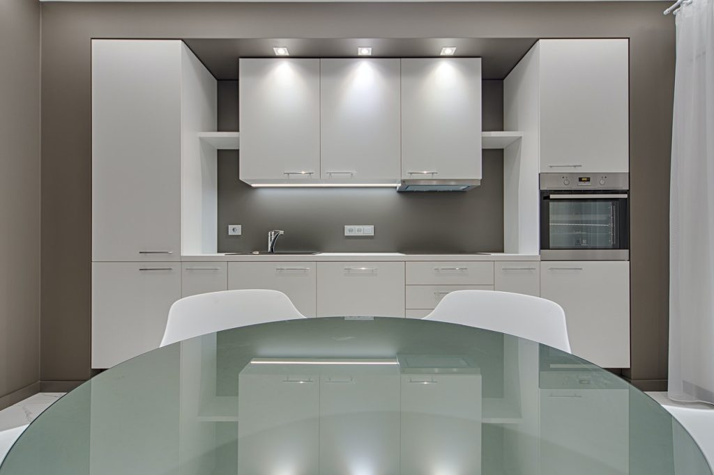
From 2000 to 2021, there has been a wide variety of colours that have been selected as the Pantone Colour of the year. There have been calming blues with ‘Cerulean’, bold shades with ‘Tigerlily’, and beautiful animated colours like ‘Living Coral’. Each one could be used to create a lively and thriving kitchen in your home. This year, Pantone’s yellow/grey combination brings plenty of energy and personality to the kitchen, too. Illuminating could be used on kitchen walls and be complemented with tile backsplashes and kitchen accessories to match. When using Illuminating Grey, the paint colour will match well with grey countertops and kitchen cabinets too.
Brave Ground, on the other hand, adds a completely different aesthetic to kitchens. Rather than a colder grey kitchen, the shade is a neutral brown that can bring a warmer feel to your home. The rich, earthy tone is quite flexible and versatile to use as it can pair well with other colours and furnishings. Be sure to complement these colours with plenty of wood and interior flora for a complete natural interior design look.


