- New build dwelling completions in England over the next year are estimated to be 300,0001.
- Over the past year, half of people report negative emotions towards new build homes2.
- Darren Watts, Showroom Design Director at Wren Kitchens shares four ways to add character to blank canvas new build properties.
Over 166,000 new build homes were built during the year ending September 2023, as the demand for affordable housing continues to rise within the UK.
However, recent social listening data reveals that a huge 50% of people feel negatively towards new builds, which they claim is likely due to the lack of character and originality they have in comparison to older properties.
Yet, experts at Wren Kitchens state that the blank canvas of a new build property can easily be transformed in four simple steps through injecting colour, layering texture, and manipulating lighting.
Darren Watts, Showroom Design Director at Wren Kitchens shares his interior design tips to help elevate your new build.
Incorporate contrasting textures and shapes.
The beauty of a new build is that it is usually a completely blank canvas, allowing you to add whatever colour and texture combinations you desire without it clashing with existing features.
Darren suggests layering textures to add both visual interest and a sensory experience, such as linen, jute, shearing, and wool, through furnishings, such as dining room seating, throws, rugs, tablecloths and runners, or bedding.
“These textures and fabrics are also perfect going into cooler winter months as they absorb the heat and create a homely and comforting environment”, he adds.
Manipulate the space with tactical, soft lighting.
One of the quickest and easiest ways to change the feeling of a room is to manipulate it with clever lighting ideas, according to Darren. This can be a game changer when it comes to the white-washed clinical look found in many new builds.
“Low lighting, warm lighting, and colourful lampshades can create dimension, warmth, and softness. Look for an orange lampshade or a warm orange lightbulb to create a cosy environment and eliminate the harsh effect of bright white overhead lights.
Integrated lighting can also add an alluring and luxe feel to any kitchen. Under-cabinet lighting and drawer lighting work well to create subtle brightness within the kitchen. Internal wardrobe lighting can also be incorporated into your bedroom storage for a luxe addition. This trend works well within smaller spaces too, cleverly adding light without using additional space,” explains Darren.
Statement shelving and storage.
An upside of new build properties is that they offer the homeowner a chance to create their own focal point.
Darren says that a great way to create visual interest is through shelving, adding that it doesn’t always have to be purely functional, but can also be used as a decorative feature, for example a great spot to add hanging plants.
“Shelves can make a style statement as well as providing room to stash pots. Use the space as kitchen accessories storage, to stow away everyday items like decorative mugs, coffee, tea and sugar.
Consider the placement of the different colours and designs but be careful not to overcrowd the shelves or they could leave the kitchen looking cluttered and untidy,” , he says.
Add pattern.
As with the contrasting textures and shapes, you can layer patterns through soft furnishings, such as curtains, pillows, throws, or upholster kitchen seating to showcase your character.
Darren shares, “This not only adds visual interest but breaks up the monocolour palette within most new build properties. You can be as playful as you want with intricate patterns or go for a simpler colour blocking method.”
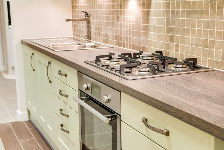
He also explains about adding patterns through more permanent interiors, such as backsplashes and worktops. “Tiled or mirrored backsplashes are a great option to add character, or look to incorporate timber, quartz, or marble worktop to contrast against plain colours.
If your kitchen walls and cabinets are neutral, then a contrasting pattern can really bring the room to life. Keep it simple with one or two rows of tiles, as a complex pattern could look too overpowering.”


